In the world of forex trading, effective decision-making is contingent upon the ability to analyze market data and discern trends. One of the most critical tools at a trader’s disposal is the forex chart. By visually representing price movements over time, forex charts help traders identify patterns, support and resistance levels, and overall market sentiment. This article will delve into the different types of forex charts available to traders, including line charts, bar charts, and candlestick charts. Additionally, we will discuss the strengths and limitations of each chart type and how to best utilize them for effective market analysis.
Line Charts

Line charts are the simplest and most straightforward type of forex chart. They are formed by connecting successive closing prices of a currency pair over a given period. By displaying the general direction of price movements, line charts provide a clean and uncluttered visual representation of market trends.
- Advantages of Line Charts
Line charts are an excellent starting point for beginners in forex trading due to their simplicity and ease of interpretation. They allow traders to focus on the bigger picture and identify the overall trend direction with minimal distractions. Line charts are also useful for tracking long-term trends and spotting key support and resistance levels.
- Limitations of Line Charts
Despite their simplicity, line charts do have some limitations. They lack the granularity offered by other chart types, as they only plot closing prices and exclude essential information such as opening prices, highs, and lows. Consequently, line charts may not be sufficient for detailed analysis or short-term trading strategies, where more information about price movements is required.
Bar Charts

Bar charts, also known as OHLC (Open, High, Low, Close) charts, offer a more comprehensive view of price action than line charts. Each bar on a bar chart represents a specific time frame (e.g., hourly, daily, or weekly) and displays four key pieces of information: the opening price, the closing price, the highest price, and the lowest price during that period.
The vertical line of a bar illustrates the range between the highest and lowest price, while the horizontal lines or “ticks” on either side of the vertical line indicate the opening and closing prices. The opening price tick is placed on the left side of the bar, and the closing price tick is on the right.
- Advantages of Bar Charts
Bar charts offer several advantages over line charts, as they provide more detailed information about price movements within a specified time frame. This additional data can help traders identify patterns, potential reversals, and areas of support and resistance with greater precision. Moreover, bar charts are particularly useful for traders who rely on technical analysis, as they display critical price data needed to apply various technical indicators and tools.
- Limitations of Bar Charts
The primary limitation of bar charts is their complexity compared to line charts, which may be daunting for novice traders. Furthermore, although bar charts deliver more information than line charts, they still lack the visual clarity offered by candlestick charts, which we will discuss in the next section.
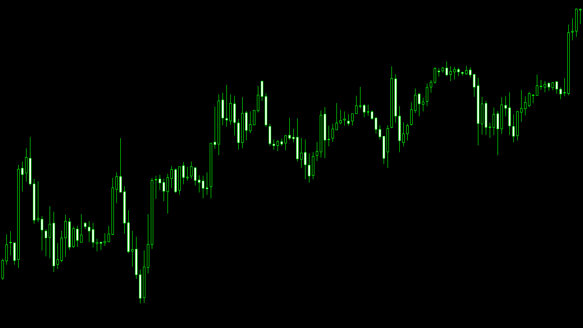
Candlestick Charts

Candlestick charts, which have their origins in 18th-century Japan, have become increasingly popular among forex traders due to their visually appealing and information-rich representation of price movements. Like bar charts, candlestick charts display the open, high, low, and close prices for a specific time frame. However, candlestick charts utilize “candles” to represent this information, making it easier to interpret at a glance.
Each candle consists of a rectangular “body” and thin “wicks” or “shadows” extending from the top and bottom. The body of the candle represents the range between the opening and closing prices, while the wicks denote the highest and lowest prices during the period. If the closing price is higher than the opening price, the candle is typically colored green or white (a “bullish” candle), signifying an upward price movement. Conversely, if the closing price is lower than the opening price, the candle is usually colored red or black (a “bearish” candle), indicating a downward price movement.
- Advantages of Candlestick Charts
Candlestick charts offer several advantages over both line and bar charts. Their visual representation of price movements allows traders to quickly and easily identify trends, reversals, and market sentiment. Candlestick charts also facilitate the use of various candlestick patterns, which can provide valuable insights into potential market developments and entry or exit signals.
Furthermore, candlestick charts can be combined with other technical analysis tools and indicators, such as moving averages, Fibonacci retracement levels, and oscillators, to generate a comprehensive picture of market dynamics.
- Limitations of Candlestick Charts
Despite their numerous benefits, candlestick charts also have some limitations. Their complexity can be overwhelming for beginners, particularly when it comes to understanding and applying various candlestick patterns. Additionally, while candlestick charts offer valuable insights into market sentiment, they may not always provide clear signals, as the interpretation of patterns can sometimes be subjective.
Renko Charts

Renko charts, originating from Japan, offer a unique and innovative approach to visualizing price movements, focusing on the significance of price changes rather than time. By filtering out minor fluctuations and concentrating on more substantial price moves, Renko charts provide traders with a clear, uncluttered view of the market’s overall direction. Constructed from a series of “bricks” or “blocks,” Renko charts plot new bricks only when the price moves by a predetermined amount (called the “box size”) in either direction, resulting in a brick-like appearance that emphasizes trends and support or resistance levels. As Renko charts disregard time and prioritize price changes, they can be highly effective in identifying and capitalizing on long-term trends while minimizing the impact of short-term market noise.
- Advantages of Renko Charts
The advantages of Renko charts include the ability to filter out market noise, a clearer representation of trends, and the minimization of the impact of short-term price fluctuations. These benefits make Renko charts particularly useful for traders who wish to focus on long-term trends and eliminate distractions caused by minor market movements.
- Limitations of Renko Charts
The limitations of Renko charts include the lack of precise time-based information, which can hinder the application of some time-sensitive technical analysis tools and indicators. Additionally, Renko charts may not be suitable for short-term traders, who require more granular information on price movements to make informed decisions.
Point and Figure Charts

Point and Figure Charts, a unique charting method that originated in the late 19th century, offer traders a distinct approach to analyzing price movements by focusing exclusively on price changes while disregarding time and volume. Constructed using a series of columns comprising X’s and O’s, Point and Figure Charts record upward price movements with X’s and downward movements with O’s. A new column is created only when there is a price reversal that exceeds a predetermined amount (called the “box size”). This method eliminates insignificant price fluctuations and emphasizes major trends.
- Advantages of Point and Figure Charts
Point and Figure Charts provide traders with several benefits, such as the ability to filter out market noise, a simplified representation of trends, and easy identification of support and resistance levels. Moreover, these charts can help traders establish price targets and stop-loss levels, which can be beneficial in managing risk.
- Limitations of Point and Figure Charts
Despite their advantages, Point and Figure Charts have some drawbacks, such as the absence of precise time-based information, which can hinder the use of time-sensitive technical analysis tools and indicators. Additionally, the lack of volume data may limit the ability to gauge market strength, and the subjective nature of box size selection can impact the overall chart appearance and analysis. Consequently, Point and Figure Charts may not be suitable for all trading styles, particularly for those who require more granular information or rely heavily on time-based analysis.
Choosing the Right Forex Chart
Selecting the most suitable forex chart type depends on the trader’s experience level, trading style, and personal preferences. Here are some factors to consider when choosing the right chart type:
- Experience Level
For novice traders, line charts can serve as an excellent introduction to forex charting due to their simplicity and ease of interpretation. As traders become more experienced and seek to incorporate additional information into their market analysis, they may transition to using bar or candlestick charts.
- Trading Style
Short-term traders, such as day traders or scalpers, may find that bar or candlestick charts provide the level of detail needed to make quick and informed trading decisions. On the other hand, long-term traders or investors may prefer line charts for their clean representation of overarching trends.
- Personal Preference
Ultimately, choosing the right forex chart type is a matter of personal preference. Some traders may find bar charts visually appealing and easier to interpret, while others may prefer the color-coded nature and additional patterns provided by candlestick charts. The key is to select a chart type that aligns with one’s trading strategy and style, as well as offers the desired level of detail and visual clarity.
Conclusion
Forex charts are indispensable tools for traders seeking to analyze market trends, identify patterns, and make informed trading decisions. Line charts, bar charts, and candlestick charts each offer unique advantages and limitations, making them more suitable for different types of traders and trading styles.
Line charts are ideal for beginners and long-term traders due to their simplicity and clear representation of overall trends. Bar charts provide more detail than line charts by displaying opening, high, low, and closing prices, making them a popular choice among technical analysts. Candlestick charts, with their visually appealing and information-rich presentation of price movements, are highly favored by traders who want to identify market sentiment and spot potential reversals quickly.
By understanding the characteristics and benefits of each forex chart type, traders can select the chart that best aligns with their trading style and strategy, thereby improving their ability to make informed decisions and ultimately enhance their trading performance.